Live DEMO - see how the Anywhere Sliders would look like in your public store.
Admin DEMO - see the plugin administration.
Note: We have dropped the support for 2D and 3D sliders since the release of nopCommerce 4.0.
Working with Nop Anywhere Sliders information. General information on how to setup your banners and sliders.
Creating a slider
You can create as many sliders as you want and add each to a place where appropriate. You can have more than one slider on a page and each one of them will work independently from the other. Sliders can be used to change images that are used as links meaning that when clicked will redirect to a given URL(page) or just use the plugin in order to add banners that are displayed on your website.
In order to create a new slider go to Nop-Templates -> Plugins -> Nop Anywhere Sliders -> Manage Sliders. Click on the Add new slider button:
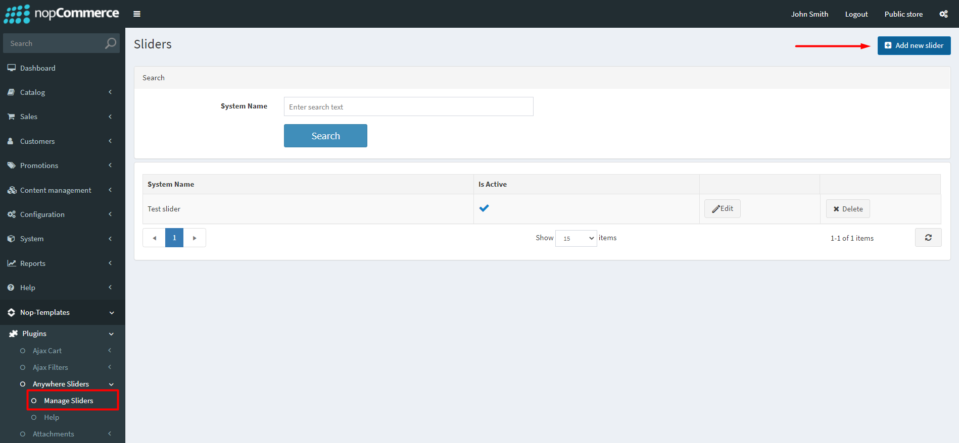
The following page will be opened:
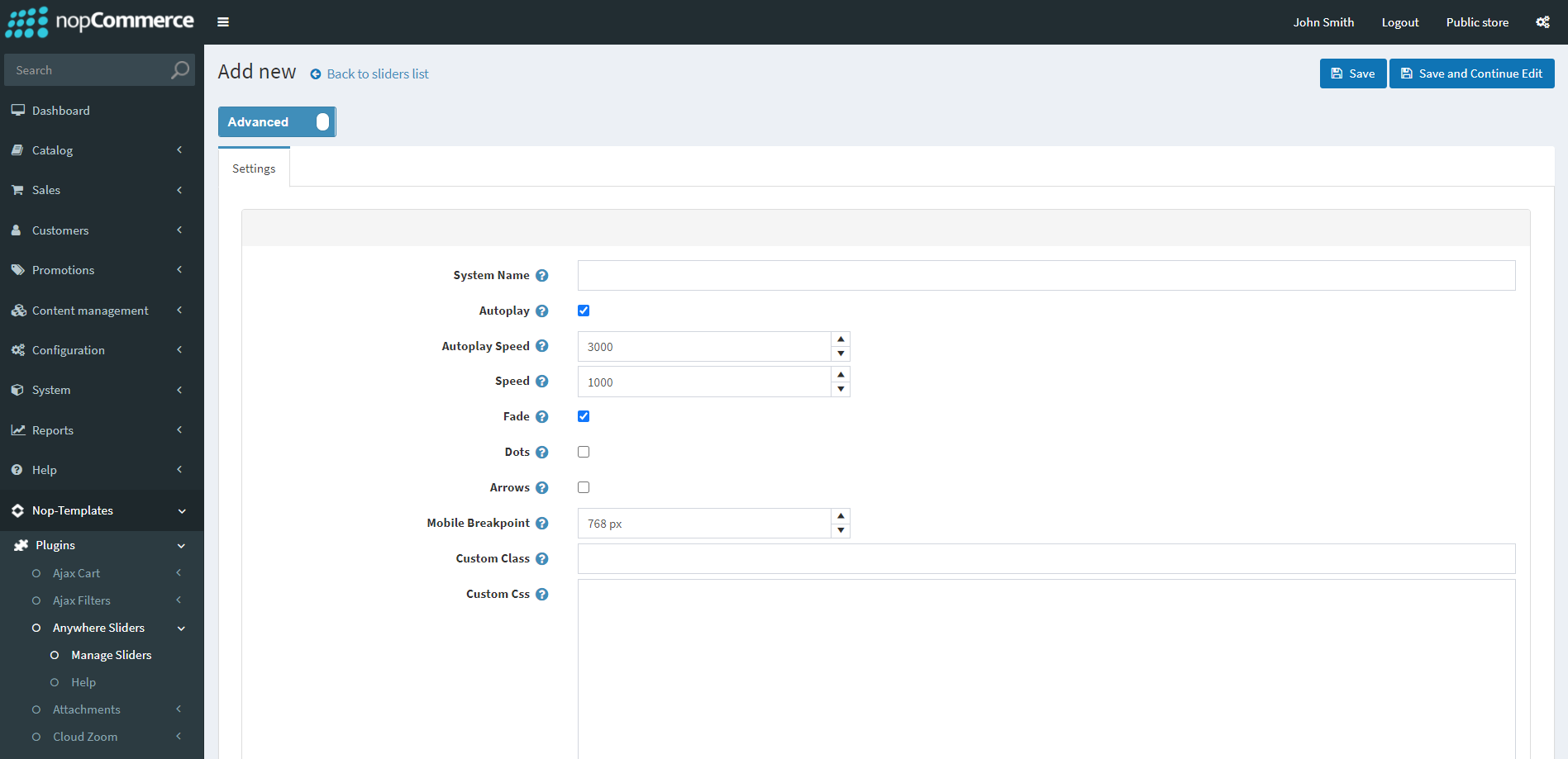
Each slider has some general settings. Here is a brief walkthrough on what each setting means:
- System Name (required) - This is the internal system name of the slider and it is used simply for your own reference.
- Autoplay - Specifies whether the slider should autoplay once the page is loaded (if the slider contains more than one image).
- Autoplay Speed - The time in milliseconds before the next slider image is displayed. By default, it is 3 seconds (or 3000 milliseconds).
- Speed - The time that it takes for the next image in the slider to be replaced with the previous one.
- Fade - Specifies whether there should be an animation, where the sliders fade into each other when transitioning.
- Dots - Enables the navigation dots in the slider, that allow your users to switch the image slides manually.
- Arrows - Enables a left/right arrows in the slider, that allow your users to switch the image slides manually to the previous/next one.
- Mobile Breakpoint - Specifies the mobile breakpoint for the slider images. If the device which the user is using is with a width less than the one specified, the mobile pictures will be loaded.
- Custom Class - Allows you to add your own custom CSS classes to your sliders. If you wish to add multiple sliders, separate them with a single whitespace.
- Custom Css - Custom CSS rules applied to your slider.
- Language - Sets the language for which the slider will be displayed.
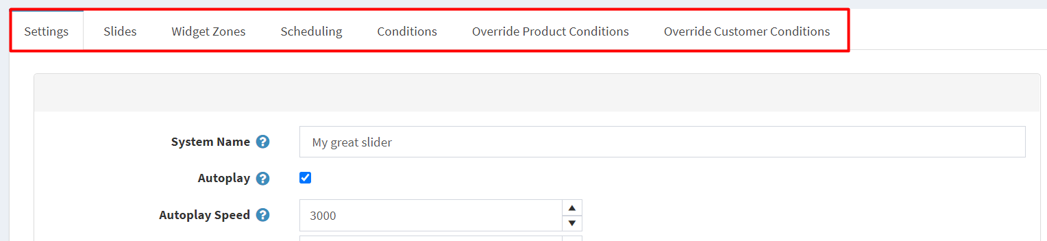
Once you create your slider and save it, you will now have additional tabs of settings:
Adding a picture/content to a slider
This can be achieved through the Slides tab: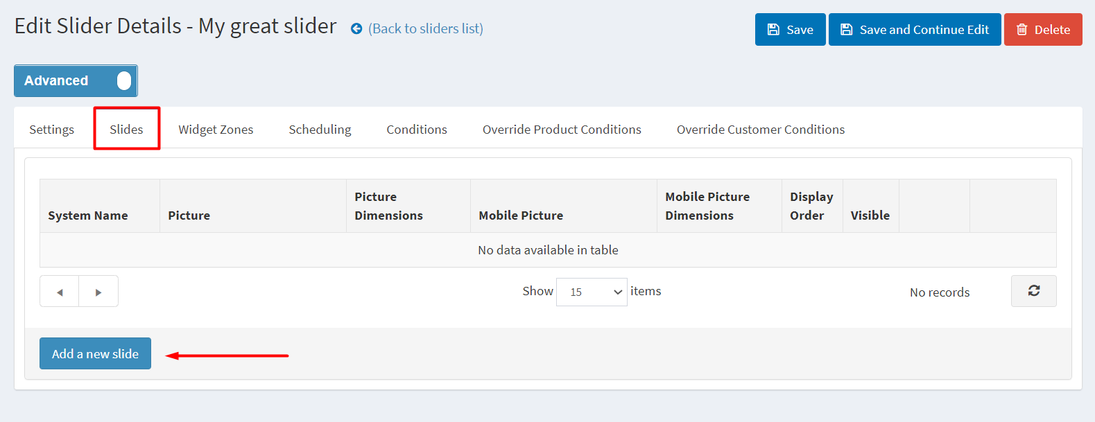
Click on the Add a new slide button and you will see a new window opened: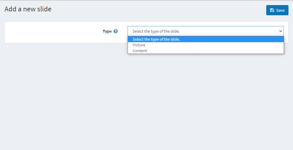
The Anywhere Slider plugin allows you to either have a Picture as a slider or your own HTML Content. For the Picture option, you will see the following screen: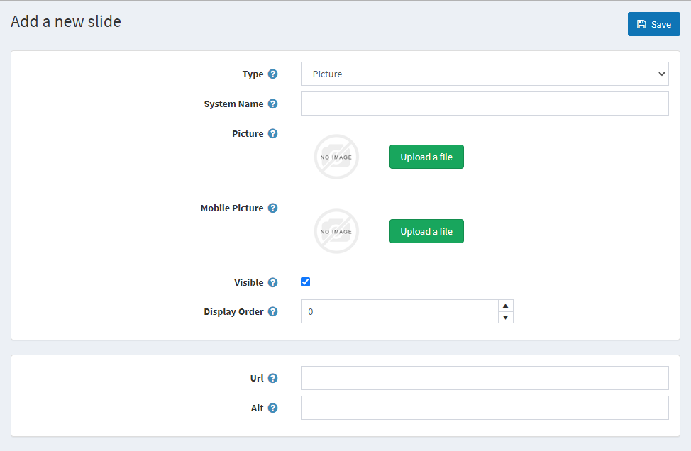
- System Name (required) - The system name of the slider is used for your own reference and is not displayed to the customers
- Picture (required) - The image is required for the Picture slider type. You can use one of the pictures you already have on your website or upload a new one from your device
- Mobile Picture - If you don't specify a mobile picture, the main picture will be used for mobile devices as well
- Visible - Whether the slide is visible or active
- Display Order - The order number of the slide in question (lower number slides appear first)
- URL - The URL where the slider will redirect on click
- Alt - The alt text of the image that is displayed, in case the image fails to load
If you want to have your own HTML Content added as a slider instead, you can select the Content option for the slide Type: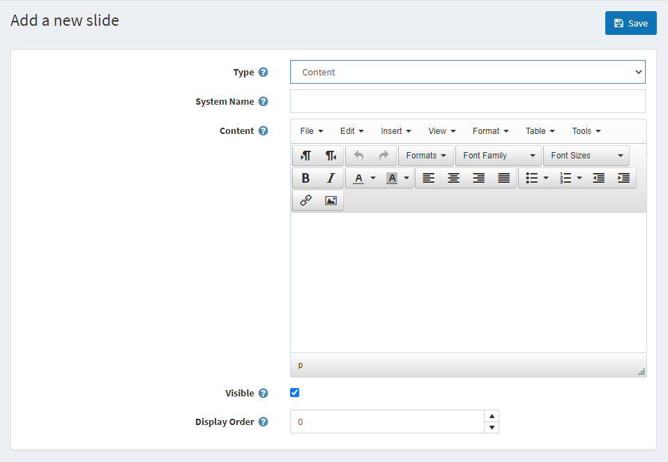
- System Name (required) - The system name of the slider is used for your own reference and is not displayed to the customers
- Content (required) - The HTML content of your slide. The native nopCommerce rich text editor is available for you to build your HTML content with ease
- Visible - Whether the slide is visible or active
- Display Order - The order number of the slide in question (lower number slides appear first)
Creating various Content type slides requires some HTML and CSS knowledge. Use the Source Code mode of the HTML editor, it is located in the "Tools" menu at the top of the editor. Put your HTML code there and add some class names to it, then use the class names to apply any visual styling by targeting your slides with CSS code. Here's a basic example of Content Slide's HTML source code that contains just image and text, and generic class names:
<div class="container">
<img class="image" src="https://your-website.com/images/your-image.jpeg" />
<p class="text">Your text goes here</p>
</div>
You can use both identical or different HTML structure for each Content slide.
Add the slider to a widget zone
This can be done in the Widget Zones tab: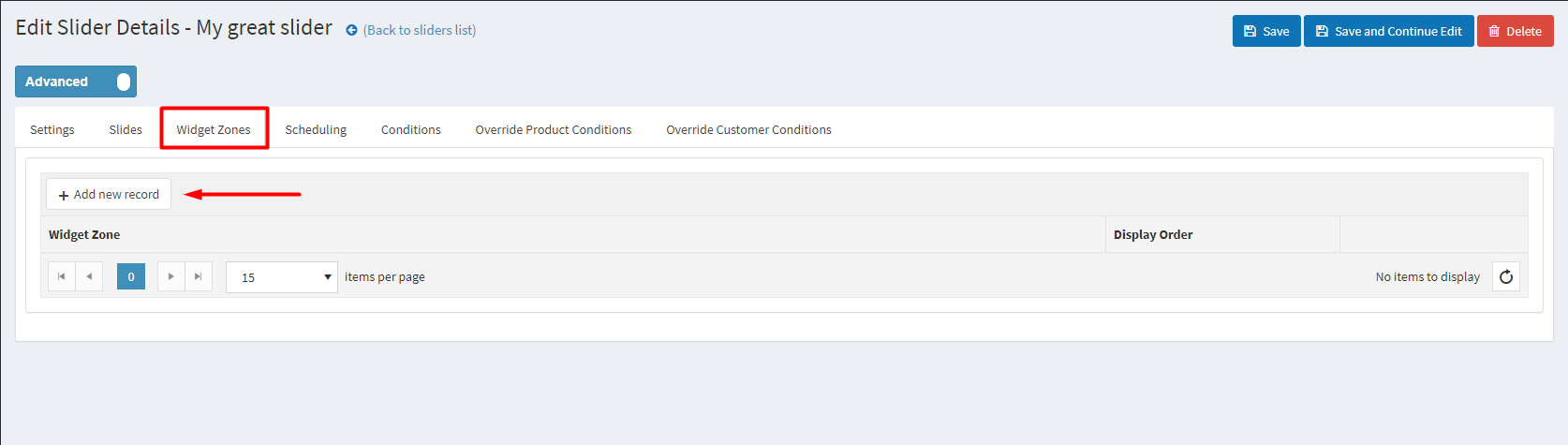
Once you have the slider and its content created, you can assign the slider to be displayed in one or more widget zones throughout your website. Click on the Add new record and you will see a pop-up that will allow you to add a new widget zone: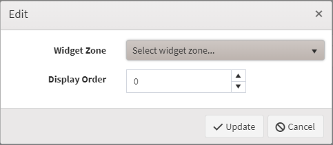
Select the widget zone and click Update and save the changes to your slider. You should now have your slider with the content that you have created on the specified widget zone.
Slider Scheduling
From the Scheduling tab you could choose how long your slider will be active, and also you could choose a time pattern to repeat and activate your slider.
Find more information here.
Slider Conditions
In the Conditions tab you can specify conditions for the current slider. If the conditions are met, the slider will be shown.
Find more information here.
Add Slider To a Certain Topic Page
You can add your slider to a certain topic page. This action will require a bit of code customization and adding your own widget zone. Follow the example below:
In this example we will be adding a slider only to the About Us topic page:
-
Edit the ~/Plugins/SevenSpikes.Nop.Plugins.AnywhereSliders/SupportedWidgetZone.xml or ~/Plugins/SevenSpikes.Nop.Plugins.AnywhereSliders/Themes/YourTheme/AdditionalSupportedWidgetZones.xml if you are using on of our themes that has that file and add the following line:
<WidgetZone>your_widget_zone_name</WidgetZone>replace your_widget_zone_name with your widget zone name.
-
Edit the ~/Views/Topic/TopicDetails.cshtml or the ~/Themes/YourTheme/Views/Topic/TopicDetails.cshtml if you are using a custom theme and your theme has that file, and add the following lines of code wherever you want your slider to show:
@if(Model.SystemName.Equals("AboutUs"))
{
@await Component.InvokeAsync("Widget", new { widgetZone = "your_widget_zone_name" })}
replace your_widget_zone_name with your widget zone name.
-
Choose your_widget_zone_name in the Widget tab in the administration of your slider.
Now your slider will be shown only on the About us topic page.