Live DEMO - see how the Anywhere Sliders would look like in your public store.
Admin DEMO - see the plugin administration.
Note: We have dropped the support for 2D and 3D sliders since the release of nopCommerce 4.0.
Working with Nop Anywhere Sliders information. General information on how to setup your banners and sliders.
Creating a slider
You can create as many sliders as you want and add each to a place where appropriate. You can have more than one slider on a page and each one of them will work independently from the other. Sliders can be used to change images that are used as links meaning that when clicked will redirect to a given URL(page) or just use the plugin in order to add banners that are displayed on your website.
In order to create a new slider go to Nop-Templates -> Plugins -> Nop Anywhere Sliders -> Manage Sliders. Click on the Add new slider button:
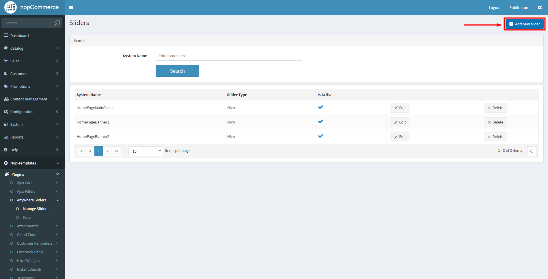
The following page will be opened:
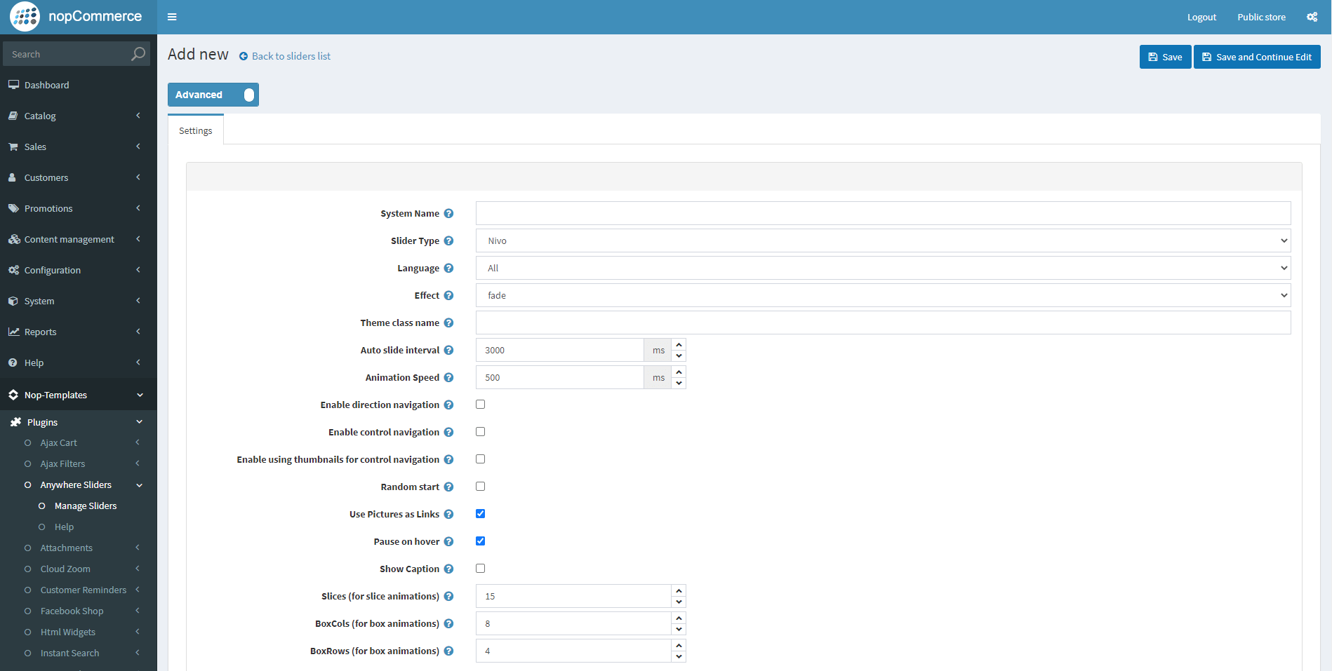
Each slider has some general settings. Here is a brief walkthrough on what each setting means:
- System Name (required) - This is the internal system name of the slider and it is used simply for your own reference.
- Slider Type - The type of the slider. Our Anywhere Sliders work with Nivo slider.
- Language - Set the language for which the slider will be displayed.
- Effect - From here you choose what effect your Nivo Slider will have.
- Theme class name - The name of the theme class that is added to the slider. For example, if you set it to light then an additional class named theme-light will be added to the slider.
- Auto slide interval (milliseconds) - The interval in milliseconds before an image is changed with another.
- Animation Speed (milliseconds) - From here you can choose the slide transition speed.
- Enable direction navigation - Enable or disable Next and Prev navigation.
- Enable control navigation - Enable or disable control navigation (e.g 1,2,3...)
- Enable using thumbnails for control navigation - Enable or disable using thumbnails for control navigation.
- Random start - If checked the slider will start sliding from a random picture.
- Use Pictures as Links - If checked the used pictures will act as links. They will redirect the user to a different page when clicked.
- Pause on hover - If checked the slider will stop on mouse hover.
- Show Caption - If checked the caption text for each image will be shown. You can add caption for your images from the Pictures tab by editing the picture and adding your content in the Title field.
- Slices (for slice animations) - Number of slices displayed in the slice animations. Increasing the number of slices makes the transition between pictures smoother.
- BoxCols (for box animations) - Number of box columns in the box animations. Increasing the number of box columns makes the transition between pictures smoother.
- BoxRows (for box animations) - Number of box rows in the box animations. Increasing the number of box rows makes the transition between pictures smoother.
Once you create your slider and save it, you will now have additional tabs of settings.
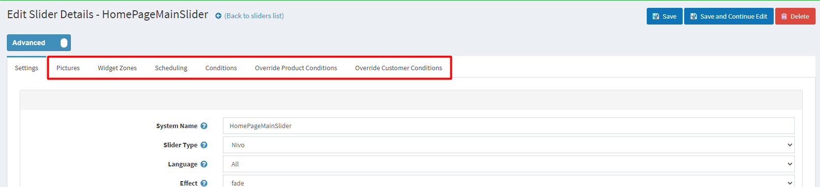
Adding pictures of a slider
Once you have a new slider created you can upload images that will be used in the slider.
To add a picture to the slider with additional data that will be used by the slider as url, display text, alternate text, click the Add a new slider image button and a new page with a detail information for the slider image will be opened.
- Picture - From here you can choose a picture from your computer and upload it.
- Visible - Specify whether this image will be visible.
- Display Order - The display order of the image. 1 represents the first slider image.
- Title - The text which will be shown when the mouse hovers the image.
- Url - The URL to which the image will redirect.
- Alt - The image alt attribute ( alternate text )
Add the slider to a widget zone
From the Widget Zones you could choose the locations in which you want your slider to appear in your public store.
If you want to add the slider to widget zones click the Add New Record button and from the drop-down select your desired widget zone.
Optionally specify a display order.
Find more information here.
Slider Scheduling
From the Scheduling tab you could choose how long your slider will be active, and also you could choose a time pattern to repeat and activate your slider.
Find more information here.
SLIDER Conditions
In the Conditions tab you can specify conditions for the current slider. If the conditions are met, the slider will be shown.
Find more information here.
Add Slider To a Certain Topic Page
You can add your slider to a certain topic page. This action will require a bit of code customization and adding your own widget zone. Follow the example below:
In this example we will be adding a slider only to the About Us topic page:
-
Edit the ~/Plugins/SevenSpikes.Nop.Plugins.AnywhereSliders/SupportedWidgetZone.xml or ~/Plugins/SevenSpikes.Nop.Plugins.AnywhereSliders/Themes/YourTheme/AdditionalSupportedWidgetZones.xml if you are using on of our themes that has that file and add the following line:
<WidgetZone>your_widget_zone_name</WidgetZone>replace your_widget_zone_name with your widget zone name.
-
Edit the ~/Views/Topic/TopicDetails.cshtml or the ~/Themes/YourTheme/Views/Topic/TopicDetails.cshtml if you are using a custom theme and your theme has that file, and add the following lines of code wherever you want your slider to show:
@if(Model.SystemName.Equals("AboutUs"))
{
@await Component.InvokeAsync("Widget", new { widgetZone = "your_widget_zone_name" })}
replace your_widget_zone_name with your widget zone name.
-
Choose your_widget_zone_name in the Widget tab in the administration of your slider.
Now your slider will be shown only on the About us topic page.