How to Optimize Your NopCommerce Store for Mobile?

If you want to keep up with current e-commerce trends and meet your customers’ needs and expectations, you must have a mobile-friendly nopCommerce store. Today, we’ll talk about m-commerce and show you how to deliver a seamless mobile shopping experience. Let’s commence!
Overview
- What is m-commerce?
- Why is it essential to optimize your nopCommerce store for mobile?
- How to optimize your nopCommerce store for mobile?
- Choose a responsive nopCommerce theme
- Follow key mobile design principles
- Ensure your nopCommerce store loads fast on mobile devices
- Optimize your navigation
- Keep important elements above the fold
- Consider how you use text
- Let your product photos do the talking
- Optimize your CTA buttons for mobile
- Simplify mobile form interactions
- Optimize your checkout for mobile
- Ask for help
- Conclusion
What is m-commerce?
Mobile commerce (m-commerce) refers to commercial transactions conducted by mobile devices. M-commerce can be categorized as mobile shopping, mobile banking, or mobile payments. In other words, examples of m-commerce go beyond online shopping through a handheld device. M-commerce also refers to money transfers, in-app purchases, digital content purchases, etc. Today, we’ll focus on the online shopping aspect of m-commerce.
Why is it essential to optimize your nopCommerce store for mobile?
2021 Mobile Commerce Stats (Source: Tech Jury)
- 72.9% of all e-commerce will be m-commerce by the end of 2021 (Source: Statista). This is a massive rise from 58.9% in 2017. Also, it is an undeniable proof that you must not underestimate the importance of optimizing your nopCommerce store for mobile.
- In 2020, US mobile retail revenues were $339.03 billion.
- Mobile commerce sales will reach $3.56 trillion by the end of 2021 (Source: Statista). This accounts for an increase of over 22.3% of the total sales reported for 2020 – $2.91 trillion. M-commerce growth statistics show that since 2016, m-commerce has seen an average increase of 33.8% yearly.
- 79% of smartphone users have made a purchase online using their mobile devices (Source: OuterBox). That’s close to a billion people worldwide!
- 76% of consumers shop on mobile devices because it saves time (Source: Dynamic Yield).
Clearly, m-commerce is here to stay. If you want to keep up with industry trends, you must deliver an outstanding mobile shopping experience.
Also, having a mobile-friendly nopCommerce store will:
- Broaden your reach
- Help you acquire new customers
- Increase customer engagement and satisfaction
- Boost your credibility
- Build brand loyalty
- Help you meet customer expectations
- Help you deliver a better shopping experience
- Make your content more shareable
- Drive more conversions
- Make your website more accessible
- Positively impact your organic rankings (mobile-friendliness has been a ranking signal since April, 2015)
- Help you stay competitive in a crowded marketplace
Next, we’ll show you how to optimize your nopCommerce store for mobile.
How to optimize your nopCommerce store for mobile?
Choose a responsive nopCommerce theme
Smartphones (and their widespread adoption) are redefining what consumers expect from online shopping. Today, people expect a certain type of functionality that is tailored to mobile. Responsiveness is no longer nice-to-have, but an absolute must.
What is responsive design?
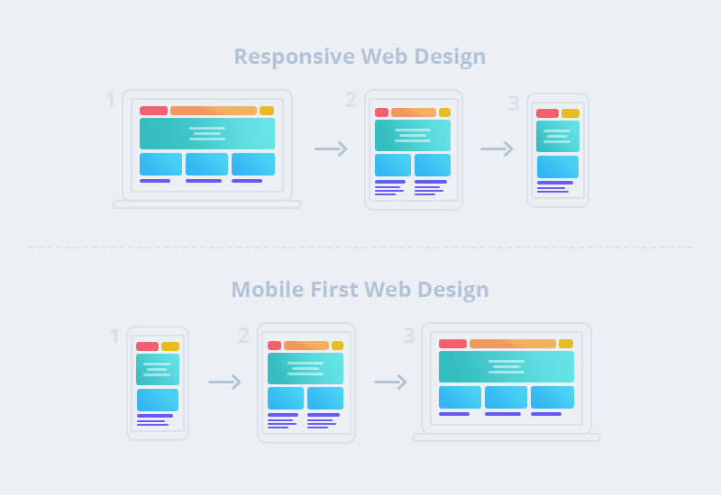
Responsive design is an approach to web design that makes web pages render well on different devices. The key element is that the site content adjusts to fit various display sizes - from small mobile device screens to larger desktop screens. Implementing responsive design ensures that your customers’ user experience will remain consistent across different devices.
Responsive design is the result of a desktop-first design strategy. This means that the website is designed for desktop computers first (at the maximum required resolution). Then, it undergoes modifications so people can browse it on mobile devices (e.g., smartphones and tablets) as well. The approach is called graceful degradation.
This is the key difference between responsive design and mobile-first design. Mobile-first design involves designing a website for the smallest mobile screens. Then, the website undergoes modifications so that people can browse it on laptops and desktop computers as well. The approach is called progressive enhancement.
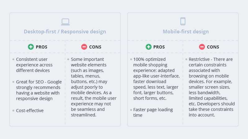
Each design approach has pros and cons.
How to choose the better option?
In 2022 and beyond, having a mobile-friendly website will be key to your success as a nopCommerce store owner. To define which design strategy works best for you, consider your business needs and where your traffic comes from. Also, you must consider development costs.
Building a mobile-first website from scratch requires working with skilled developers, designers, SEO experts, and more. The costs can quickly add up.
The most cost-effective solution is to choose a responsive nopCommerce theme that comes with additional mobile-first design features (e.g., hamburger menus, larger buttons, larger font size, etc.). Our themes meet these requirements. Each Nop-Templates theme is responsive, fast and lightweight, SEO optimized, and tested with all major browsers. Feel free to explore our themes & don’t hesitate to contact us if you have any questions → Nop-Templates, Premium & Responsive NopCommerce Themes
Follow key mobile design principles
Define what you need
Put yourself in your customers shoes. How do users interact with your website? What do they expect? What do they need? For starters, you have an online store - people come to your website to shop. Or, if they’re in the consideration stage of their journey, they come to your website to do research. This means that your website must contain valuable and easily accessible product information. Also, customers should be able to easily navigate your website and find what they need within seconds. Your website must be designed in a way that guides them and makes this process a breeze!
How to achieve this?
- Keep your design simple. Eliminate all non essential elements. Leave plenty of white space.
- Create intuitive website navigation that looks good on smaller screens. Reduce the number of links in the navigation menu.
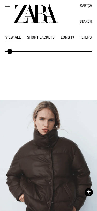
- Think vertically. Arrange your products in a way that delivers a delightful shopping experience on mobile. For example, arrange your products in columns. The best practice is to keep the number of columns under two. Get inspired by ZARA’s beautiful mobile design:
- Create descriptive product names.
- Write concise and properly formatted product descriptions. Don’t include unnecessary details.
- Select a font that is easy to read on a smaller screen. Google recommends a base font size of 16 CSS pixels.
- Keep your borders wide and lines clean.
- Ensure all elements (e.g., buttons, links, live chat icons, etc.) are easily clickable - customers should be able to click on a button without having to zoom in.
- Optimize your nopCommerce store for the “Thumb Zone” - the surface area people can easily reach with their thumbs. The term “Thumb Zone” was coined by Steven Hoober (a UX researcher and expert) who conducted a study to analyze how different people hold and use their mobile devices. According to the study 49% of users depend on a single-hand grip for device support, and 75% interact with their mobile devices using just their thumbs. Learn more: Smashing Magazine, The Thumb Zone: Designing For Mobile Users
Additional tips: How to optimize your nopCommerce store for the "Thumb Zone"?
- Important components (e.g., the navigation menu, CTA buttons, the shopping cart button, the checkout button, etc.) should be positioned in the “Thumb Zone.”
- Spacing is important. There should be enough space between the different elements on the page - this minimizes the risk of users clicking on buttons or links they don’t want to click on.
- All clickable elements (e.g., buttons, links, tags, images, etc.) should be large enough to be tapped with a thumb.
- Consider both right-handed and left-handed users.
Еnsure your nopCommerce store loads fast on mobile devices
According to Google, the probability of bounce increases by 32% if mobile page load time goes from 1 second to 3 seconds. Customers are impatient - when shopping online, they want to find what they need quickly and easily. This is especially true for mobile browsing, since people usually use their phones on the go.
To improve your site’s loading speed on mobile devices:
- Optimize your content for search intent & ensure you include only relevant information.
- Choose the right font. If possible, use a system font, instead of a custom font. System fonts are installed on most computers (as opposed to custom fonts which might have to be downloaded to your customers’ devices when they visit your website). System fonts are classified as mono, serif, or sans-serif. Each of these font families consists of different fonts. For example:
Mono: Consolas, Liberation Mono, Lucida Console, Menlo, Monaco.
Serif: Apple Garamond, Baskerville, Droid Serif, Iowan Old Style, Source Serif Pro, Times, Times New Roman.
Sans-serif: BlinkMacSystemFont, Helvetica Neue, Roboto, Segoe UI, Ubuntu.
- Implement lazy loading.
- Use a CDN. A CDN is a group of servers (dispersed at strategic locations around the world) that distributes the content delivery load (e.g., images, JavaScript or CSS files, etc.) through the server located closest to the visitor’s location. This increases your store’s page speed and helps you deliver a better shopping experience. In our opinion, this is an absolute must for all e-commerce websites. Learn more → Cloudflare, What is a CDN? | How do CDNs work?
- Ensure your images are the appropriate size and resolution for mobile screens.
- Host your videos on external sources (such as YouTube and Vimeo) and use lite embeds. This can reduce the size of your web pages by almost 1 MB. The standard embed code from YouTube requires some files to be downloaded even before your customers play the video. This may slow down your website. To avoid it, you can use lite embeds. In this way, when the page loads, the site only embeds the thumbnail image of the YouTube video, and the video itself (including all JavaScript code) loads only if the customer clicks “Play.” Learn more → Lite YouTube Embeds - A Better Method for Embedding YouTube Videos on your Website
- Avoid using pop-ups. Even though they’re great for capturing emails and promoting sales, they’re difficult to close on mobile screens. This may hinder the shopping experience and frustrate your customers. Besides, they can negatively impact your page speed.
- Avoid using sidebars - they’re distracting, take up too much screen “real estate,” and can negatively impact the user experience on mobile. Also, they can slow down your pages.
Optimize your navigation
There are two things you should consider when it comes to mobile navigation.
First, when we use our phones, we’re constantly scrolling, swiping, tapping, etc. Everything happens quickly and in swift motions. This is why it’s important that all essential page elements and business-critical information are always on the screen. You can achieve this by integrating a fixed navigation bar into your design. Your fixed navigation bar should contain a CTA button, a link to your homepage, a link to the shopping cart page, and a link to the checkout page.
Second, mobile screens are smaller. Therefore, to deliver an even better mobile shopping experience, you should simplify your navigation. More specifically, you should:
- Reduce the number of navigational layers - on mobile, it is easy to get lost amongst a myriad of categories, subcategories, filters, tags, etc. The more complicated your navigation is, the higher the chances are that consumers will leave. So, keep it simple and stick to one level of nested content.
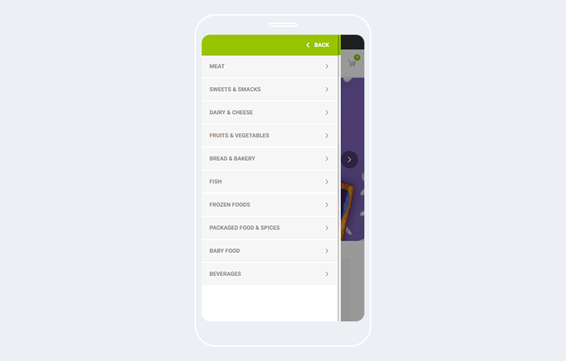
- Use a mobile-friendly menu alternative (e.g., a hamburger menu). This will save space and help you deliver a better shopping experience.
- It should be clear how the menu can be opened and closed.
- Ensure that customers know exactly where they are at all times. This can be achieved if you implement breadcrumbs. Also, you can highlight the category or subcategory the customer is currently viewing.
- Use a robust plugin like Nop Mega Menu to build a custom menu. You can choose which menu items (categories, manufacturers, vendors, products, topics, pages) to include from the predefined menu item list. You can also create custom links, customize the look of each menu item, and much more.
Keep important elements above the fold
Your logo, search bar, navigation menu, CTA button, shopping cart, and checkout button must be above the fold. This will help you deliver a more informed mobile shopping experience and will create a smooth conversion path (with a limited number of actions).
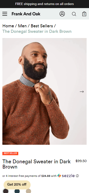
Consider how you use text
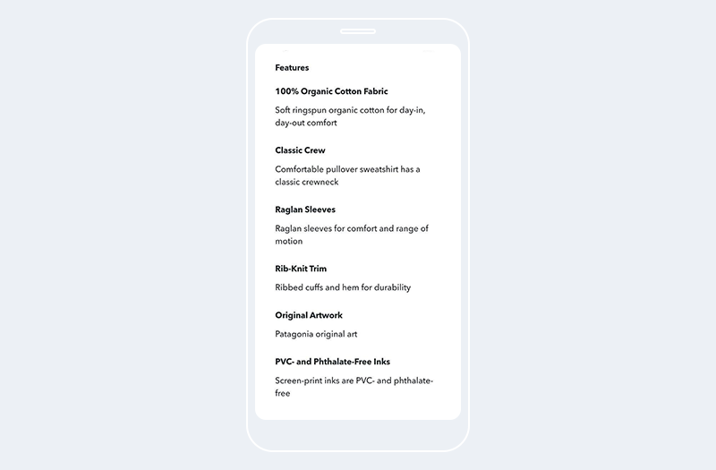
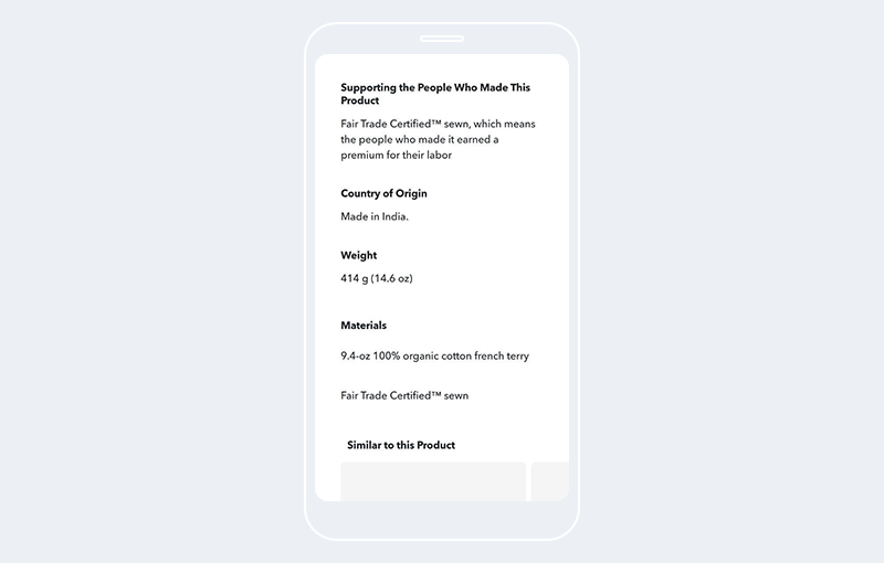
Mobile devices have a limited screen space. This means that you must present all essential product information in a concise, yet engaging manner. Let’s have a look at this product page: Patagonia, Men's P-6 Logo Organic Cotton Crew Sweatshirt
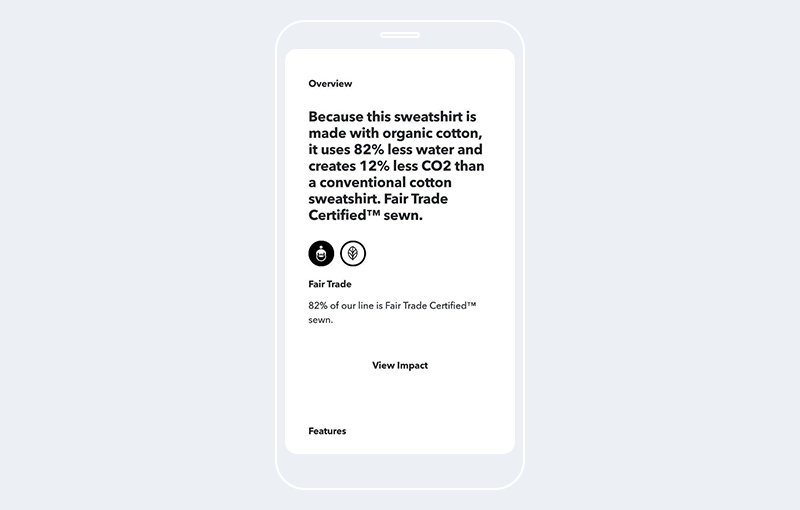
The overview is focused on the product’s environmental impact. This is very on-brand for Patagonia. Also, the paragraph is short, and contains only essential and specific information. This instantly boosts the brand’s credibility and makes the product more appealing.
Next, we see a list of features. The text is easy to read, and the formatting is perfect. Each feature is in bold and contains a short and meaningful description.
Note: Remember that a customer shouldn’t have to zoom in to read your product descriptions. The best practice is to choose a UX-friendly font that is between 14 and 16 pixels. It is a good practice to choose a contrasting font color.
Let your product photos do the talking
Mobile shopping is a visual experience. We already pointed out that the use of text should be minimal. In this section, we’ll explain exactly how you can leverage product photos and use them in a way that delights your customers, answers their most burning questions, and drives sales.
First and foremost, product photos should be the focal point of your product and category pages. For example, your category page can contain a simple and sophisticated grid of beautiful product photos & limited copy. This is a perfect example of how visuals can simplify the website’s navigation and facilitate the decision making process.
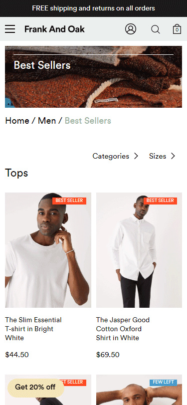
As for your product pages - a beautifully designed and easy to navigate photo carousel (that displays the best product features and showcases the product from different angles) is always a good option!
Source: Frank & Oak
Second, use real product photos. In this way, you will showcase the product features in a highly authentic manner. It is best to include photos that showcase the product in different settings - a neutral background (the classic product photo), a model wearing the item (if it is a piece of clothing or an accessory), showing the product in use (if it is an appliance, a tool), etc. If you have product variants, use real photos for each variant - this will help you deliver a more informed and seamless shopping experience that emulates the experience of shopping in a brick-and-mortar store. For example, don’t leave shoppers wondering how a particular item looks in a different color - adding a photo for each variant will build confidence in your products and help you turn hesitant shoppers into first-time buyers. Also, it will reduce the number of returns which will save you time and money.
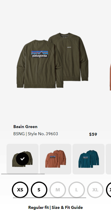
Source: Patagonia, Men's P-6 Logo Organic Cotton Crew Sweatshirt
Optimize your CTA buttons for mobile
Your CTA buttons should be:
- Prominently placed above the fold and visible at all times. This is a way to constantly remind your customers to take action in an effective and non-intrusive manner. It is best to use a contrasting color that matches the overall aesthetics of your website - in this way the button will instantly catch your customers’ attention, but it won’t look awkward, intrusive, or out of place. For example, have a look at Scotch & Soda’s CTA button.
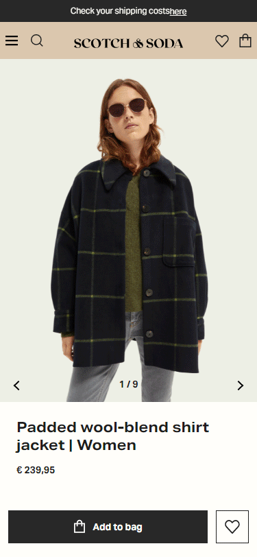
- Easy to tap. Zooming is a big “No” on mobile. Your customers should be able to tap on your buttons using just their thumbs. Also, there should be enough space between the different tap targets, so that a customer doesn’t accidentally tap a button they don’t wish to.
- Your CTA copy should be straightforward (e.g., “Add to Cart,” “Buy Now,” etc.).
Simplify mobile form interactions
Shoppers should be able to easily get in touch with you at all times - this will give you credibility, build confidence in your products, and help you acquire more customers. In other words, having a contact form is an absolute must. Of course, you must consider how your customers will interact with your forms on a mobile device. Complicated or long forms cause frustration and are a common reason for cart abandonment.
To optimize your forms for mobile:
- Place form fields in the “Thumb Zone.”
- Remove all unnecessary fields.
- Write descriptive form labels.
- Disable autocorrect on the “Name” and “Address” fields.
- There are many things to consider in terms of spacing between the different fields. On the one hand, customers should be able to fill in each field with ease (using their fingers). One the other, more space requires more scrolling which could hurt the overall user experience. Test different options to find the balance.
- The keyboard should automatically adjust to the field types. For example, you should have an alphabetical keypad for the “Name,” “Email,” and “Address” fields, and a numerical keypad for the “Phone number” and “Credit card information” fields.
Optimize your checkout for mobile
Mobile shopping carts have an abandonment rate of 85.65% (Source: Barilliance). A complicated checkout process is one of the most common reasons for cart abandonment. This is why it’s important to optimize your checkout for mobile. To achieve this:
- Reduce the number of steps a customer has to go through, and the number of fields they need to fill in. Ask for relevant information only. The less your customers need to type, the higher the chances are they’ll complete their checkout.
- Your checkout button should be prominently placed above the fold. Ensure it is large enough to be tapped with a thumb. Use contrasting colors and a clear CTA.
- Integrate different payment gateways.
- Offer a guest checkout option. More often than not, people are in a hurry to place an order. Or they don’t want to register. Or, maybe, they’re not 100% sure they want to place an order and any unnecessary step they have to go through, is a reason for them to abandon their cart. Offering a guest checkout will eliminate friction and help these impatient and hesitant buyers convert. (Luckily, nopCommerce offers the option to check out as a guest out of the box. Also, after a customer completes the anonymous checkout, you can ask them to create an account.)
Ultimately, a mobile-friendly checkout is fast, reliable, and clutter-free.
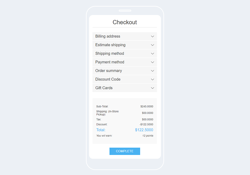
NopCommerce offers two types of checkout out-of-the-box:
- A standard checkout with a progress bar.
- A 6-step accordion checkout: “Billing address,” “Shipping address,” “Shipping method,” “Payment method,” “Payment information,” and “Confirm order.” To continue to the next step, customers must first fill in all required information in the previous step. Keep in mind that the purchase information your customers provide is not visible throughout the whole checkout process. This can cause friction and frustration.
If you want to avoid this and turn the checkout process into a delightful and seamless experience for your customers, you can use our Nop One Page Checkout plugin. As the name suggests, it allows customers to check out on a single page (which eliminates friction, reduces cart abandonment, and increases conversions).
Ask for help
If you’re not a developer and find it difficult to implement these changes yourself, we strongly advise you to contact a certified nopCommerce partner who can optimize your store for mobile.
Conclusion
Mobile shopping is more popular than ever. If you want to keep up with current trends, you must deliver a stellar mobile shopping experience. To achieve this, you must:
- Use a responsive nopCommerce theme
- Follow key mobile design principles
- Improve your store’s speed on mobile devices
- Implement a fixed navigation bar and simplify your navigation
- Keep important elements above the fold
- Minimize the use of text and put product photography front and centre
- Optimize your CTA buttons for mobile
- Simplify mobile form interactions
- Optimize your checkout for mobile
- Reach out to a certified nopCommerce partner if you need help
If you have further questions, just leave a comment below!


