Profile: Stefan
User posts
the menu 10% of it is hidden at right
Hi Habib,
Would it be possible to let me know the account with which the theme was purchased?
Thank you in advance.
Hi wwrighter,
All our themes are designed with mobile experience in mind and are fully responsive. As to the navigation bar, we have a theme that has it out of the box like Poppy but if you like any other theme you can let us know so that we can see if this can be easily changed in the theme.
Hope that helps.
Hi there,
Unfortunately, we cannot guarantee that every third-party plugin will work with our themes. The plugin overrides some of the files of the theme thus making it incompatible with the theme.
I would suggest waiting for the nopCommerce version 4.10 which is to be released in a month with the GDPR functionality properly built-in. Then all our products will support this out of the box when it is part of the official nopCommerce release.
However, if you plan to use the plugin on your current store, it should be styled and updated in order to match the theme structure and styling. For that purpose, please submit a ticket in our system and we will let you know what the options are.
Hope that helps.
Out of the box the pavilion is not that mobile friendly (big images and only one and one product at a time)
But after just a few tweaks by insert a small code in the setting of the theme
Custom Head Styles It becomes a lot better (look at bottom for the code
For the shopping cart depending on what payment provider you havc chosen
i would recomend going for one step checkoput.
This is the code for tweaking responsive thatw e use
@media (min-width: 769px) {
.item-box {
width: 23.5%;
}
.item-box:nth-child(3n+1) {
clear: none;
margin-left: 2%;
}
.item-box:nth-child(4n+1) {
clear: both;
margin-left: 0;
}
}
@media all and (max-width: 480px) {
.item-box {
width: 49%;
margin-left: 2%;
}
.item-box:nth-child(2n+1) {
clear: both;
margin-left: 0;
}
}
Hi Freddy1234,
Thanks for the input. It is really helpful for everyone who wants to have 2 items per row on mobile.
Thanks again.
Hi abhiz,
Please see my comments below:
1. There is no option out of the box to have 2 items per row in the Pavilion theme, but this can be achieved with a little customization which we will provide if you decide and purchase the theme.
2. As to the checkout process, by default in nopCommerce you have either the standard checkout or a one page checkout. But in both cases, you will need to fill in all the required fields. In the One Page Checkout you will not need to go through each page, but fill all the information on one page. If you want to further improve the checkout process, you can get the Nop One Page Checkout which you can get with a 50% off the price and use this plugin in the theme. This plugin is styled for all our themes.
Hope that helps.
http://themes.earth1.element.nop-templates.com/wallets

Hi Eduardo,
Thank you for your feedback. We are aware of this issue and is planned to be fixed right after the holidays. Hope that it is not too much of a delay.
Merry Christmas and all the best to you and your team.
Hi edgardoni,
Please see my reply from the nopCommerce forum post.
The reason that you need to save again the preset is because most probably when doing a deploy your are not uploading a file that is generated as a result of the preset. Each color combination is saved into a generated file called theme.custom-{storeId}.css file that can be found in Themes/Pavilion/Content/css. So when doing a deploy I assume you are deleting all old files and deploying the new ones excluding this custom file. So that is why when you save the preset in the administration again, the file is generated and the preset is applied. In order to fix this, just include the generated file in your deploy package.
Note: you should note that any other custom code added in the theme settings in the custom head styles textbox will be included there as well. So make sure that you have the same settings applied on your local and live server so that replacing this file will not cause any differences.
Hope that helps.
Ho Sorano,
Thank you for the links. I found out what the problem is. It is caused by a modal dialog that is displayed when opening the site - the newsletter subscribe popup. After it is closed part of it stays above the link, although it is invisible, and makes the links below unclickable. Please see the image below. I have underlined the part of the code that is the issue and how is positioned above the header.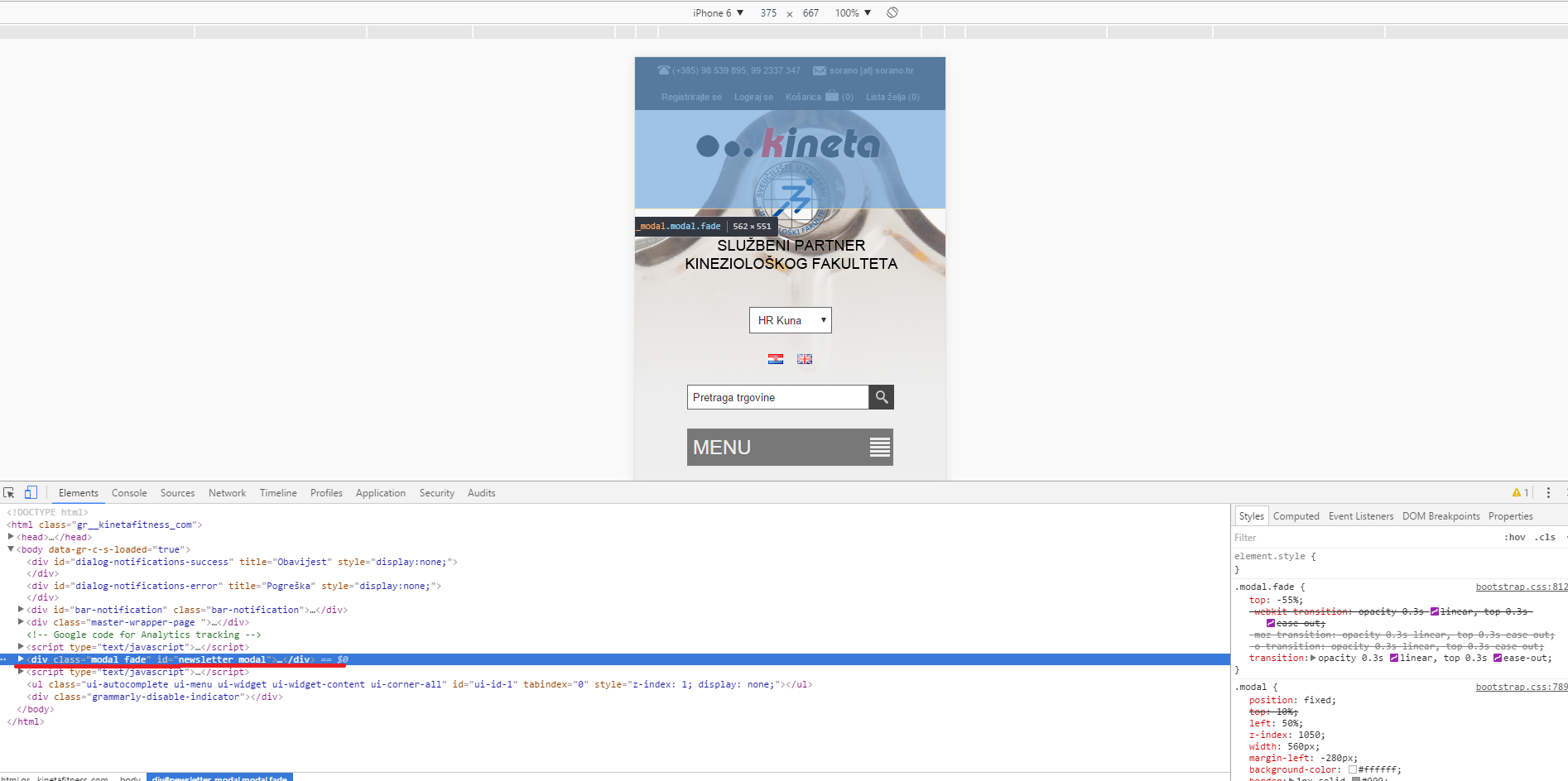
Hope that helps.
Hi sorano,
It is interesting that there is an issue only on one of the sites. It may be due to some custom CSS that you have added or some issue with the theme in a specific scenario. Would it be possible to send us a link to the store so that we can see what is the difference and the issue if there is any?
Looking forward to your reply.
Hi Prateek,
Thank you very much for the feedback. There was an issue left from the upgrade to 3.80 that we have fixed. In order to integrate the fix just download the theme in 1 hour (we are deploying the fix right now) and replace the following file with the one from the downloaded package:
Themes\Brooklyn\Views\Product\ProductTemplate.Grouped.cshtml
Your feedback is highly appreciated.


