Are you ready for the New Google Mobile Algorithm Update?

Last November Google introduced the mobile friendly snippet to the mobile search results giving a hint about the future changes in their algorithm. Till now the mobile friendly label only indicated to searchers which sites are optimized for mobile and which are not.
With the new algorithm update to take place on the 21st of April, Google will start using mobile friendliness as a ranking signal. Or in other words they will be rewarding or penalizing websites for their mobile experience. So, if your site fails to perform well on mobile devices it will be harder to find on those devices or it may entirely disappear from the mobile search results.
If you are wondering why Google is doing this, remember the last time you came across a website which was not optimized for mobile. Most probably you got frustrated and bounced off. Being well aware of this, Google have decided to serve in their mobile search, only sites which offer a good mobile user experience.
If your website uses responsive design it should already be prepared for the upcoming algorithm change. If you are not sure whether your website is mobile friendly here is what you can do to test it.
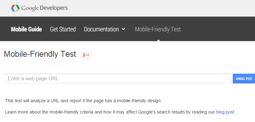
Run a Google mobile-friendly test – enter the URL for your home page or for any other page on your site into Google’s Mobile-Friendly Test to get them evaluated. You will establish in seconds whether your site passes or fails the test.
Here are some common mistakes to avoid on mobile, identified in the Google’s Mobile SEO Guide:
- Blocked JavaScript, CSS and image files
- Unplayable content
- Faulty redirects
- Mobile-only 404s
- App download interstitials
- Irrelevant cross-links
- Slow mobile pages
If your site does not pass the test you need to act quickly and optimize your store for mobile, because most probably your competitors have done it already.
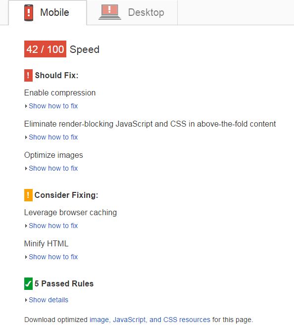
If you pass the Google Mobile Test your website is certainly adequate on mobile devices. To take it a step further you might want to make sure that its speed performance on mobile is good too by consulting the Google Developer’s Page Speed Insights. It will tell you whether:
- You’re using Flash in a way that creates problems on mobile.
- You need to eliminate render-blocking JavaScript and CSS in above-the-fold content
- You are using a hosting which may be hindering site performance.
- You could have a better use of browser caching to speed up performance.
- You could optimize the images and other resources on your site.
Of course you should not optimize your website for mobile in order to just see the green colors on the Google bench marks. If you are in e-commerce for example, having a mobile-friendly website is a great asset. It would allow your potential customers to easily find your store, browse your products, buy them without frustration on any device possible and keep coming back to do more shopping.
If you are running your online store on nopCommerce and looking for a ready-made solution, don’t miss our great responsive themes. They have not only passed the Google Mobile-Friendly Test with flying colors but are also offering the best mobile shopping experience for nopCommerce.


