Working With Nop Product Ribbons
Working with Nop Product Ribbons information. General information on how to setup your ribbons.
1. Creating a ribbon

You can create as many ribbons as you want.
In order to create a new ribbon go to Plugins -> Nop Product Ribbons -> Product Ribbons. Click on the Add Product Ribbon button as shown on the image above.
a) General Information

The General Information tab, contains general settings for the current ribbon.
Enabled - If checked then this product ribbon will be activated. If unchecked then the product ribbon will be deactivated.
Name - This is the name of the ribbon and is a required field. It is needed, so that you can separate your ribbons form each other as you can have as many ribbons as you want.
Stop adding ribbons after this one is added - It is possible that you have several ribbons that could be shown for a given product, so if this is checked you can guarantee that no other ribbon will be show after this one is shown.
Priority - As it is possible to have several ribbons for the same product then the priority number is used to sort the ribbons and show them in this order. The ribbon with the lowest priority number will be shown first, then the next ribbon etc. The order is important especially in cases when a given ribbon has the Stop adding ribbons after this one is added enabled then no other ribbons will be shown after it.
From date - Set the start date from which the Ribbon will be activated. This is very useful for example when you want to show a ribbon for a season sale and you can set when the promotion of this sale to start.
Leave empty if you don't want to limit the ribbon by any strat date and it will be activated unless you have a To date set (see below). The From date is in UTC time.
To date - Setting the end date to which the ribbon will be active. This is useful when you want to stop showing the ribbon after this date. For example when your special offer is over and the ribbon doesn't make sense any more. The To date is in UTC time.
b) Category Page Ribbon

In the Category Page Ribbon tab, you can configure the ribbons that are show on all pages, except the one show on the big product image on the product page. We separated the big product image, because it is bigger than all of the other images, hence you can add a bigger ribbon to it.
You can use the Available Product Tokens in the Text field. The tokens will be automatically replaced with their values for the product, on which the ribbon will be shown.
NOTE: We reccomend, that you remove the default Container style css if you are using a picture as a product ribbon.
c) Product Page Ribbon

In the Product Page Ribbon tab, you can configure a ribbon that is shown exclusively over the big image on the product page.
You can use the Available Product Tokens in the Text field. The tokens will be automatically replaced with their values for the product, on which the ribbon will be shown.
NOTE: We reccomend, that you remove the default Container style css if you are using a picture as a product ribbon.
d) Conditions part 1 - Default State

In the Conditions tab you can specify conditions for the current product ribbon. If the conditions are met, the product ribbon will be shown.
The Default State property is set to Fail by default. This means, that if you do not add any contitions the ribbon will not be shown on any product in your store. If you set the Default State property to Pass the ribbon will be shown on all of the products in your store.
e) Conditions part 2 - Condition Groups

We understand that in the most cases the ribbons will not be used for all of the products in your store. That is why we created custom conditions. The conditions consists of Condition Groups. You can add as many condition groups as you like. The Default State is also considered as a condition group. A Condition Group consists of one or many Condition Statements (rules). You can read more about the Condition Statements in the steps below.
The dependancies between the Condition Groups is OR and between the Condition Statements is AND. This means if all of the Condition Statements in one Condition Group are true for a product, the ribbon will be displayed over that product.
To add a Condition Group you need to click on the Add Condition Group button.
To delete a Condition Group you need to click on the Delete button, that is located i the title of the Condition Group grid.
To add a Condition Statement to the Condition Group, you need to click on the Add new record button.
f) Conditions part 3 - Condition Statements

When you click on the Add new record button, in a Condition Group this popup will appear.
From the Type dropdown, you can choose a type for the Condition Statement (rule).
From the Operator dropdown you can choose the operator that will be applied for the Type and Value. The operators can be EqualTo, NotEqualTo, LessThan, GreatherThan, etc.
The Value is either in dropdown (for the Categories and Manufacturers) or a numeric textbox. In it you can select the value for your Condition Statement.
g) Conditions part 4 - Condition Example

In the picture above, you can see an example of a Condition Group with two Condition Statements.
Because of this condition the ribbon will be shown when the Category of the product is EqualTo Computers >> Notebooks and the Product Age in Hours (the time since the creation of the product) is LessThan 120 hours. If any of this Condition Statements is false the whole Condition Group is false and if the Default State is set to Fail the conditions are not met, and the ribbon will not be shown for the current product.
You can Edit or Delete a Condition Statement by clicking on the respective buttons.
h) Product Overrides part 1 - The Product Override Tab

From the Product Overrides tab you can include or exclude products regardless of the conditions. For example if you add a product with the include state, the ribbon will be shown over that product, regardless of the conditions. If you add a product with the exclude state, the ribbon will not be shown over that product, regardless of the conditions.
You can add a product override by clicking on the Add a new product button.
i) Product Overrides part 2 - Creating a Product Override

To add a Product Override you need to seletc the product, by clicking on the checkbox next to it. You can also change the State of the product.
After you have selected your products, you need to click on the Save changes button, or on the Cancel changes if you want to discard of your selection.
You can filter your products by Product name, Category, Manufacturer, Store and Vendor.
After you have finished adding Product Overrides, click on the close button at the top right corner of the window and you will see the Product grid refreshed with the added product overrides.
j) Product Overrides part 3- Editing a Product Override

In the picture above, you can see two product overrides. A product from the Notebooks category have the Exclude state. This means, that the ribbon will not be added for this product.
A product from the Games category have the Include state. This means, that the ribbon will be added for this product, regardless that this category is not added in the Conditions tab.
From the grid, shown in the picture above, you can edit or delete a Product Override.
You can also edit the product override from the Add A New Product popup window.
k) Adding Ribbon Images

You can add a ribbon image, by clicking on the Ribbon Images menu.
To add an image click on the Upload a file button, select your image and click on the Add picture button.
l) Product Ribbon Settings

In the Nop Product Robbons Settings you can find general settings for the plugin.
m) Sample Category Page Ribbon
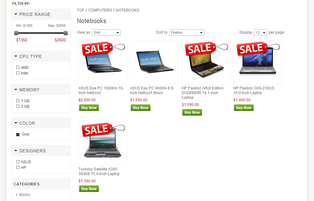
Here is a sample Category Page Ribbon. As you can see the ASUS product that we added as Product Override with state Exclude, have no ribbon.
This is an example of the category page, but the ribbon will be shown in any page, that contain this products.
n) Sample Product Page Ribbon

This is a sample of the Product Page Ribbon. You can see that the image here is bigger, than the image used for the Category Page Ribbon.